
Design systems
Design for enterprise
Interaction design
Microsoft data visualization
Company
Microsoft
|
Year
2020 - 2024
Overview
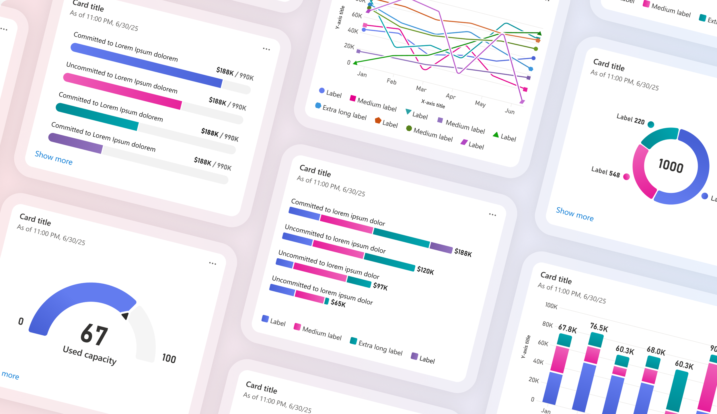
A Microsoft-wide initiative to unify data visualization into a single UI library within the Fluent design system and to standardize its implementation across product teams, backed by a fully funded engineering team

My role
I was one of the founding designers who identified the need for this library and helped define its early strategy and scope. Over four years, the effort scaled from a handful of designers to 50+ contributors across the company. I stepped into a leadership role for data visualization at Microsoft, working alongside 2 other core designers.
The problem
Microsoft’s many data-centric products presented complex data inconsistently, which led to cognitive overload for users navigating the Microsoft ecosystem.
This issue stemmed from a lack of centralized UX guidance and engineering support for data visualization. Consequently, individual teams incurred high costs designing and shipping experiences in isolation, further exacerbating the problem.
The solution
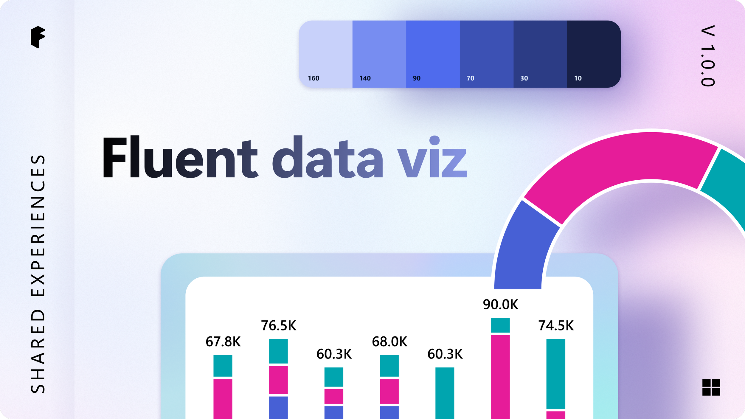
A single, robust charting library flexible enough for any product team to adopt, grounded in the “One Microsoft” philosophy, built using D3 and Fluent UI controls.
The process
Creating clarity at the beginning
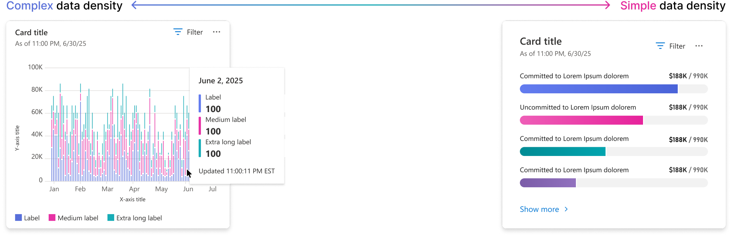
The collaboration started organically among designers as an effort to create coherence across enterprise products, including Azure and M365 Admin Center, and more. Because of this, high cardinality visualizations and scalability were critical considerations.
Shortly after we established a foundation in data density, we expanded our collaboration to include the Fluent design system team. This meant expanding our data visualization library to be inclusive of Microsoft’s full portfolio, from education platforms like Teams with their needs for simplicity and delight, to Azure’s high density requirements for maximum data accuracy.
Design principles

Scalable
The library needed to flex for both preset datasets and datasets that advanced users, such as IT workers, can create themselves to build a custom dashboard.

Increased data comprehension
More legible layouts and advanced interactions like hover cards to make them more readable and actionable.

Accessible
Robust accessibility features from screen reader functionality to a full color palette that passes the 3:1 color contrast ratio for all datasets within a chart.
Scoping the library
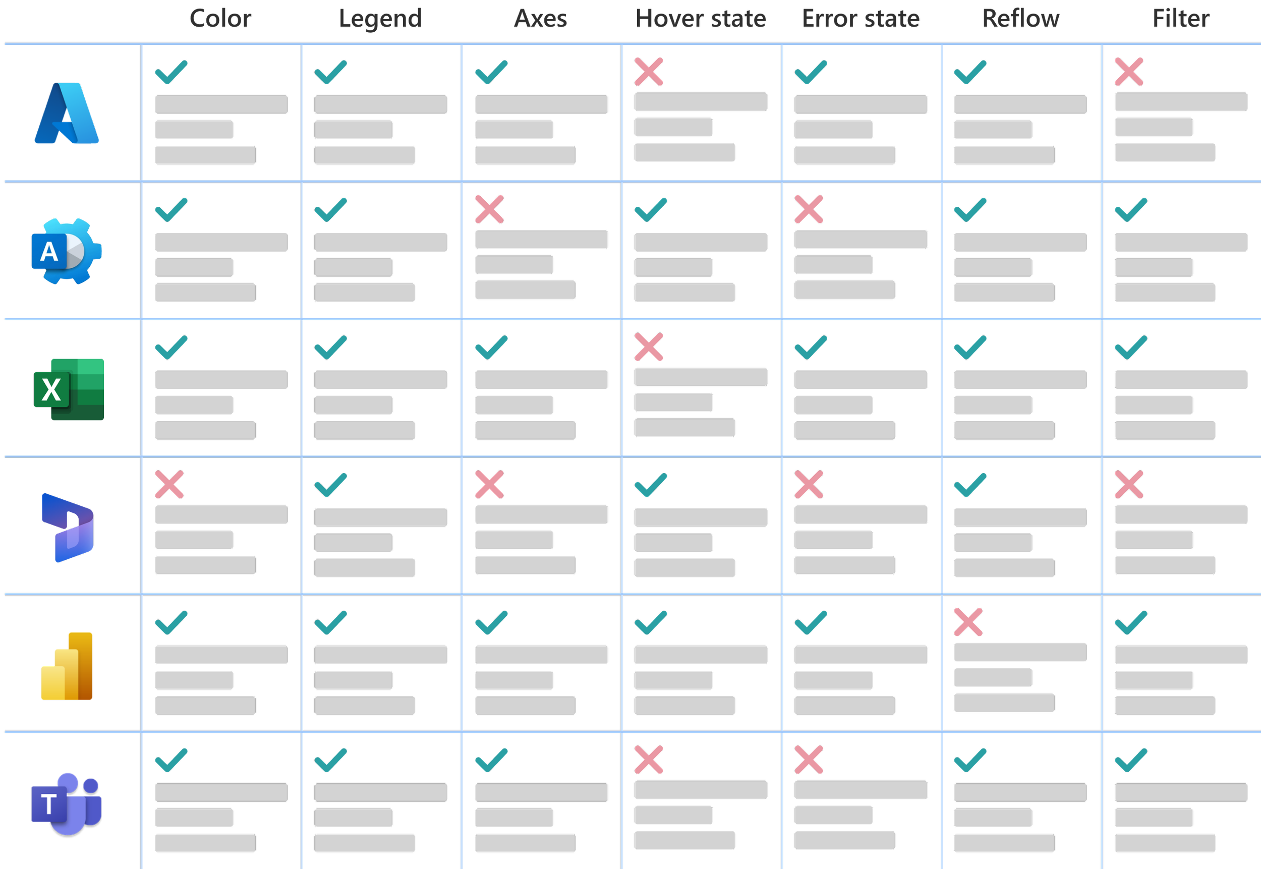
We defined the set of chart types that we would go on to design and develop as a core library. We began by comparing to define the priorities and scope further
We defined the library's core chart types by first auditing existing solutions across products, identifying where teams were solving the same problems differently and where functionality was missing outright. That gap analysis became the basis for our priorities and scope.
Each designer then owned one or more chart types or chart elements, producing a full spec covering anatomy, variations, size and layout, appearance, behavior, reflow (including text truncation), and accessibility. I ran weekly syncs across the team to review work in progress — our forum for getting into the weeds on details like hover interactions and reflow behavior.
Developer specs
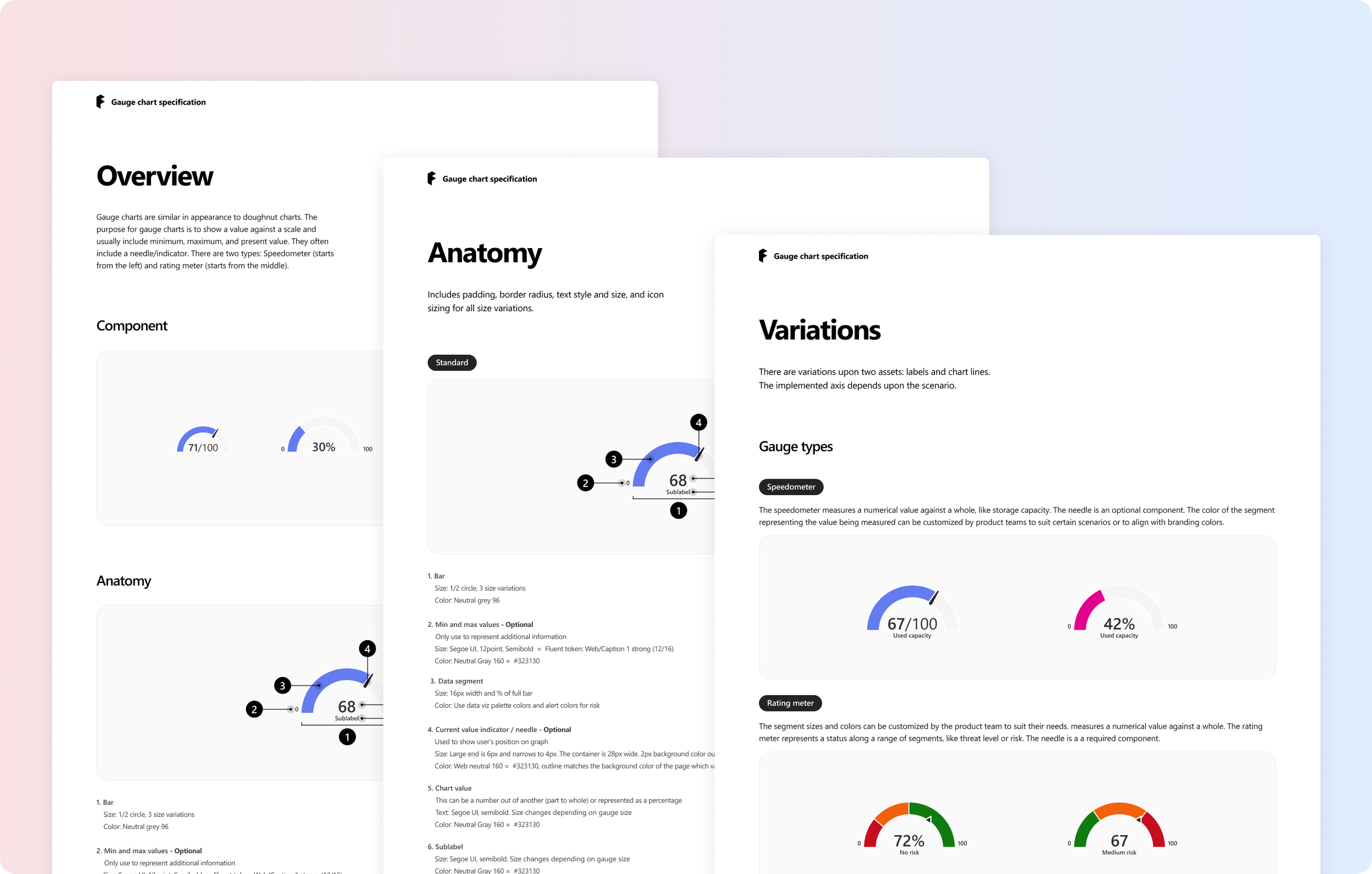
We created a developer spec for each chart type to address chart anatomy, variants, size and layout, appearance including dark mode and light mode, interaction, reflow (including text truncation which is tricky when it comes to charting), and accessibility.
Usability research
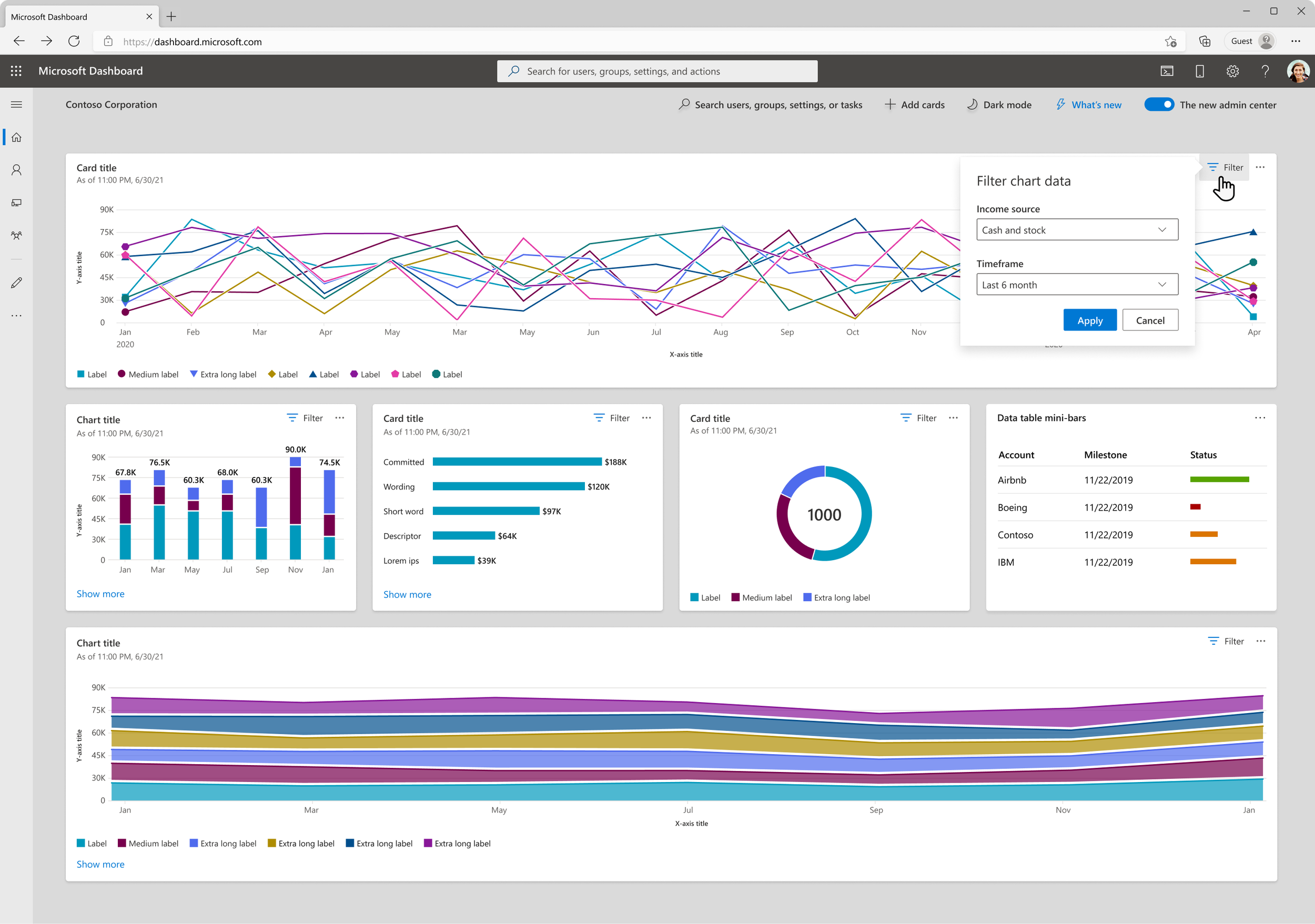
Our usability research, centered on interaction design, directly informed the scalable development of our charting library. We developed a product-agnostic prototype to test key interactions across the various chart types, gathering insights on users expectations when filtering, engaging with legend overflow, and the overall expected behaviors of manipulating data.
We also continuously conducted lit reviews throughout the entire process starting in 2020 as well as competitive analyses by looking at products like HighCharts and Grafana.
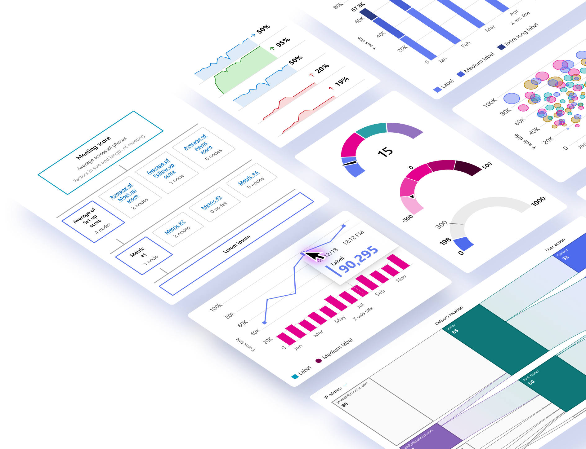
Chart elements
Color
Axis
Legend*
Hover card
Truncation
Reflow
Filtering
Type ramp*
Error/empty state*
In total, we produced comprehensive dev specs for 16 chart types 9 chart elements including axis, filtering, typography, hover card, and error state.
Chart types
Line chart
Vertical bar
Vertical stacked bar
Vertical grouped
Horizontal bar*
Horizontal stacked*
Area chart
Gauge*
Sankey chart
Sparkline
Tree diagram
Pie chart
Donut chart
Heat map
Count annotation bar
The end result
Publishing the component library
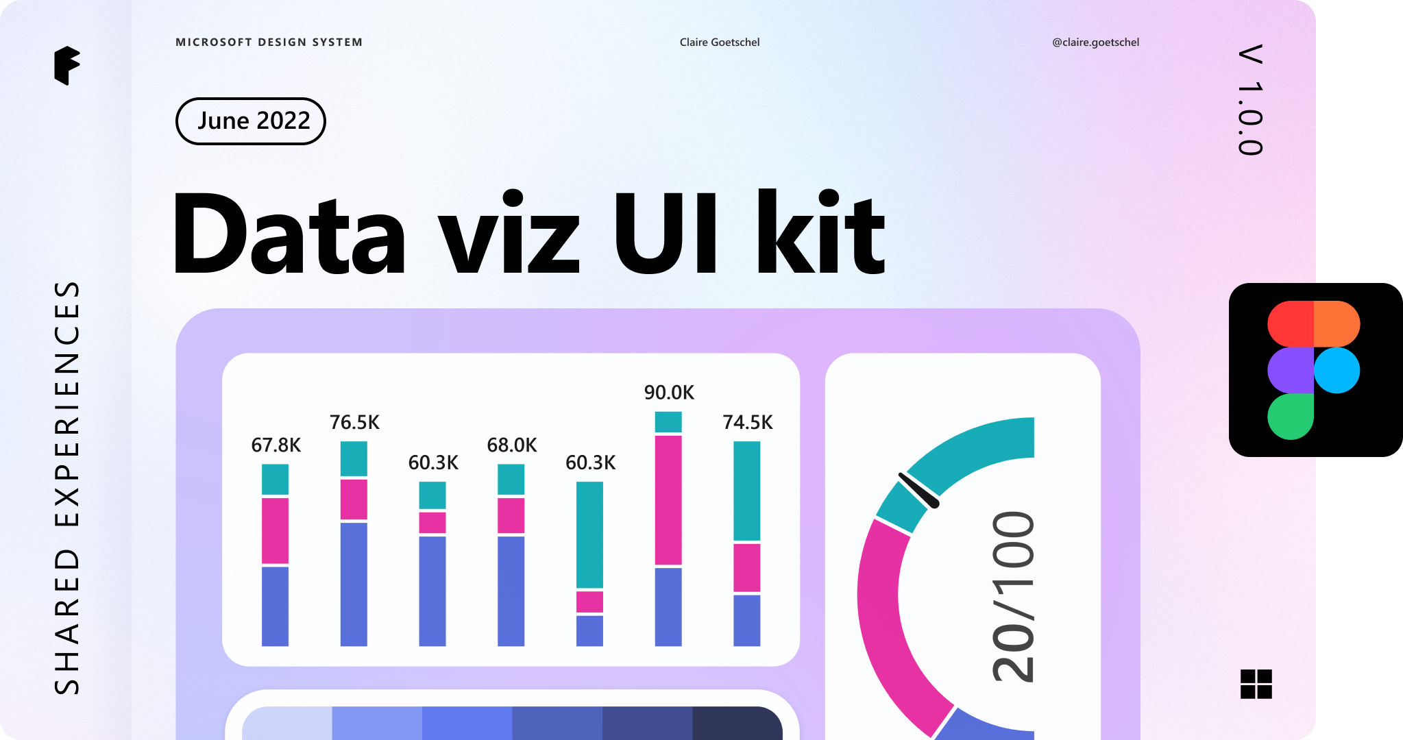
We published a UI kit in Figma for product teams to easily plug in charts from the library into their designs.
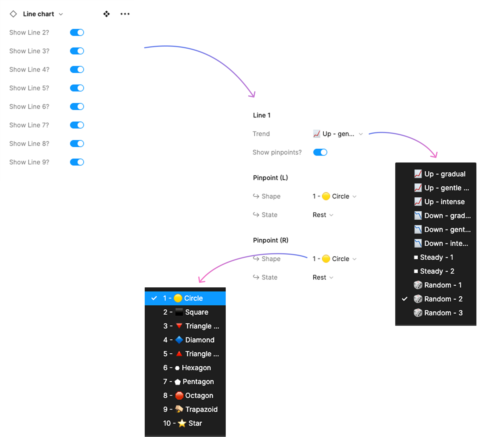
Each chart type was created with robust variants, autolayout, text editing, and the 40+ color palette, reducing the need to detach components and consequently unifying the chart elements adopted by designers and their product teams.
Shipped!
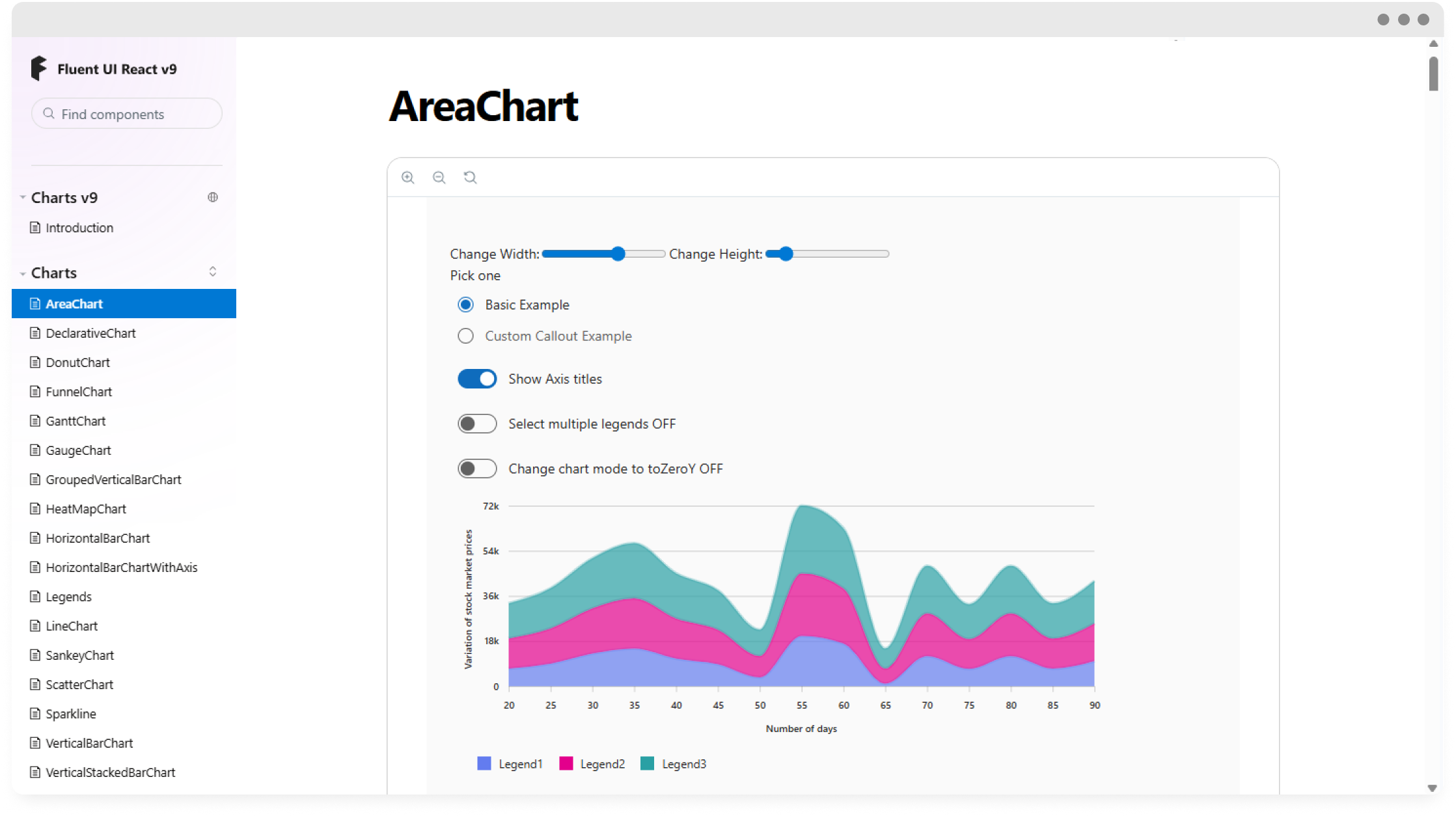
The small but very mighty engineering team successfully built an interactive, accessible, and highly customizable charting library. The final product was built in D3 + the Fluent V9 design system and easily adoptable in React, Angular, and WebComponents.
Today, hundreds of projects across platforms like Azure and M365 Admin Center have adopted the library.