
UX strategy
Design for enterprise
Design systems
Microsoft Azure service hubs
Company
Microsoft
|
Year
2025
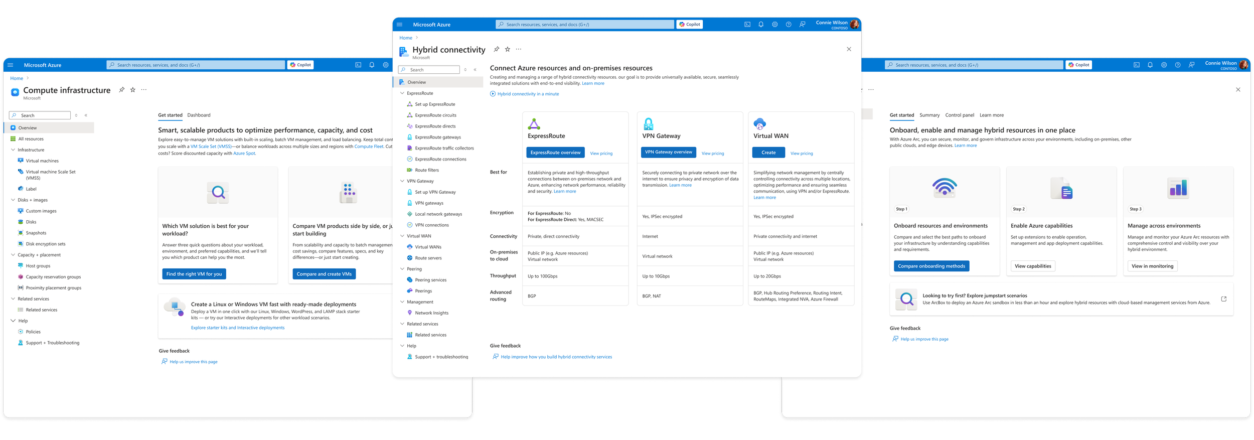
Overview
Azure offers 500+ cloud services — a scale that had become unmanageable.
Customers entering the Azure Portal couldn't reliably answer three basic questions:
Which services solve their problem
How similar services differ from one another
How multiple services are combined into a single workload
For a platform whose growth depends on customers successfully adopting and expanding their usage, this wasn't a rough edge — it was friction sitting directly on top of Azure's core business model.
As part of the Azure Design System team, I led the UX framework for "hubs" — scenario-based groupings of services designed to make Azure navigable at its actual scale, rather than in spite of it. The framework I built became the standard used by product teams across Azure's core infrastructure services.

My role
I led the design strategy and UX framework for hubs across Azure’s core infrastructure services, with responsibility spanning:
Defining the core interaction patterns for hub experiences
Driving alignment across 10 product teams and 100+ stakeholders
Creating scalable design patterns and UI components
Leading cross-team UX audits and pattern synthesis
Partnering with research, content strategy, and PM to document guidance
Evangelizing the framework across Azure UX
The problem
Azure customers experience two compounding usability issues when using the Portal:
1. Service discovery
With hundreds of services available, customers struggled to understand what each service did, differentiate between similar offerings, and where to even start for their specific need. Many relied on external documentation or search, or gave up on Azure entirely. This was a strong signal that the product itself was failing at its most basic job.
2. Navigation across workloads
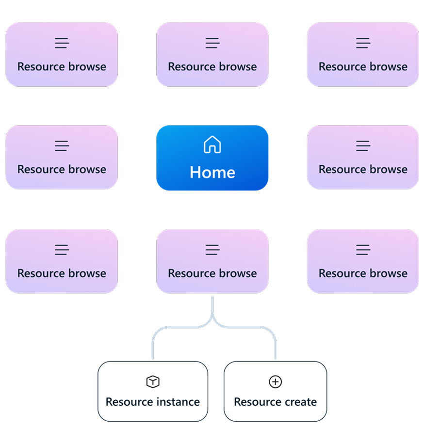
Even after the user chose a service to deploy, the Portal offered no clear path showing how other services fit into a complete solution. There was no information hierarchy connecting individual services into the real-world scenarios customers were actually trying to build.
Left unaddressed, these two problems didn't just create a clunky experience — they inherently limited the extent of Azure that any given customer could successfully use.
The solution
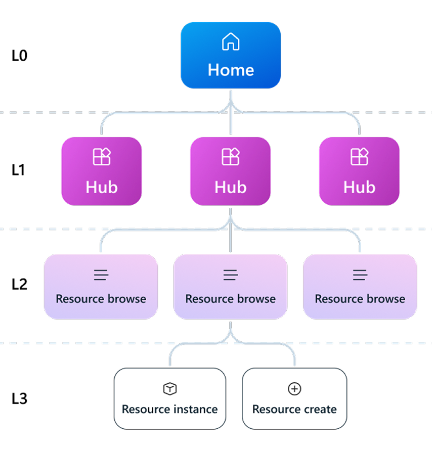
Scenario-based hubs
A “hub” is a consolidated grouping of services and resource instances built around real user scenarios. A hub is designed to help users:
Discover and differentiate product offerings to make a faster, educated choice
Provide critical context to support adoption and success
Support management tasks beyond resource boundaries
Internally we called these experiences “hubs,” but in the product itself we used clear scenario naming to reduce complexity for customers.
Rationale for prioritization
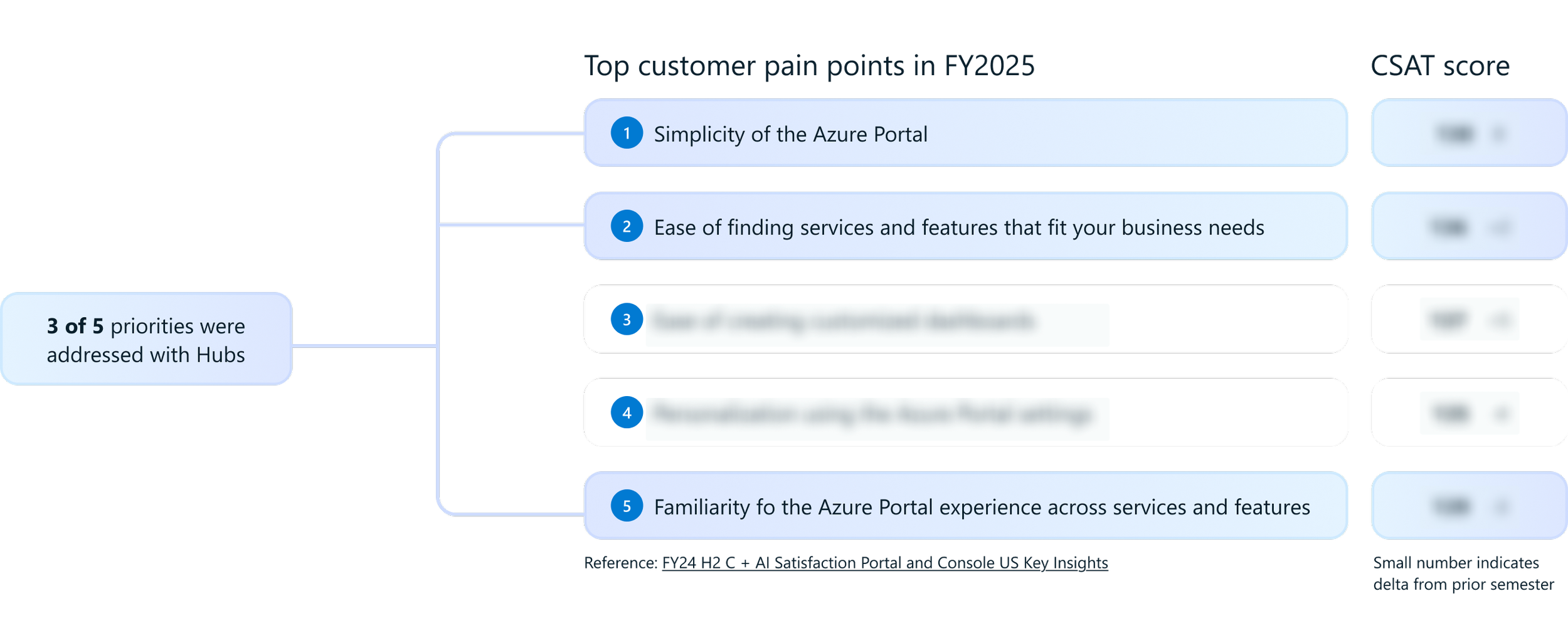
Ongoing customer satisfaction research and usability studies consistently surfaced the same message: Users found Azure's complexity overwhelming, they struggled to find the services that matched their needs, and hit friction every time they tried to move from one service to another in the Portal. Customers weren’t ask for more features but instead they asked, repeatedly, for it to just be simpler.
That consistency across research is what elevated this from a backlog item to a design system-level priority. A platform this large doesn't get simpler on its own. Someone has to build the scaffolding. That's the gap this initiative was created to close.
Identifying design opportunities
To establish a scalable framework, I partnered with Azure’s three core Infrastructure as a Service (IaaS) organizations—Compute, Storage, and Networking— to understand how their users navigated, discovered, and compared offerings at each stage of the customer lifecycle.
What I found was that every team's problem looked different on the surface: Compute needed to raise discoverability of its virtual machine scale set service, while Networking needed to help users work through the technical differences between three similar offerings.
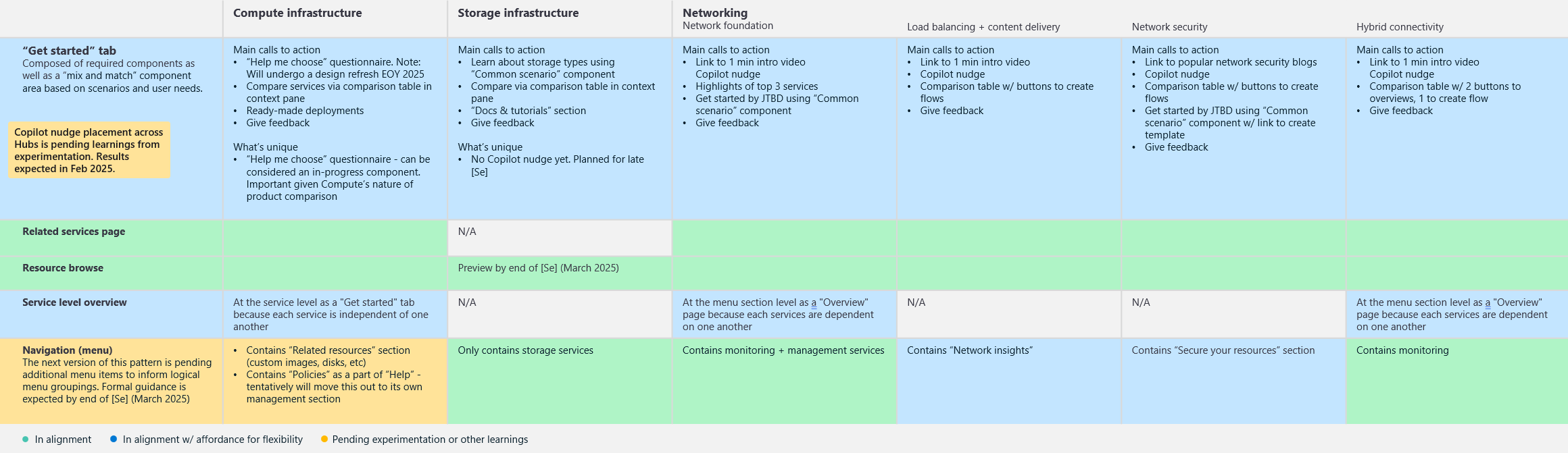
Each product team had independently started designing its own hub experience, which meant Azure was on track to solve the same problem five different ways — the exact fragmentation this project existed to prevent. I ran a cross-org UX audit to evaluate these early concepts side by side, identify where they needed to align, and pull out the strongest emerging solutions as candidates for formal design patterns.


Key findings
Teams were independently solving the same UX challenges in different ways, which pointed to four clear opportunities to unify around shared patterns:
Service discovery
Scenario guidance
Navigation structure
Workload monitoring
Outcome
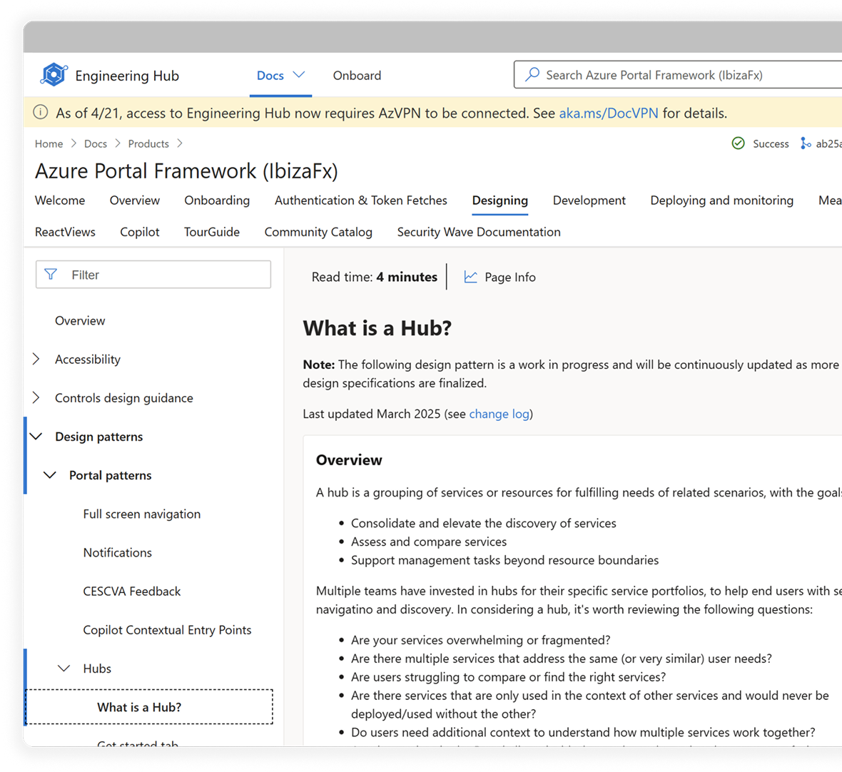
From the audit, I distilled 5 common design patterns and 10 core UI components for teams to adopt across their individual hubs — turning five divergent, in-flight efforts into one coherent system before they could ship inconsistently and lock in the fragmentation for years.
Examples
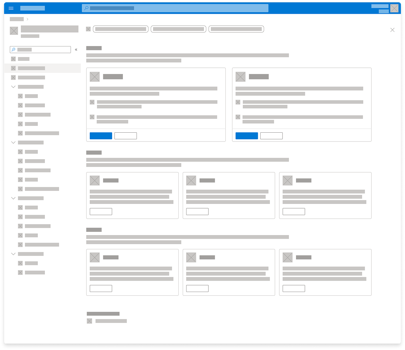
Overview page
New Azure users consistently struggle to know where to begin.
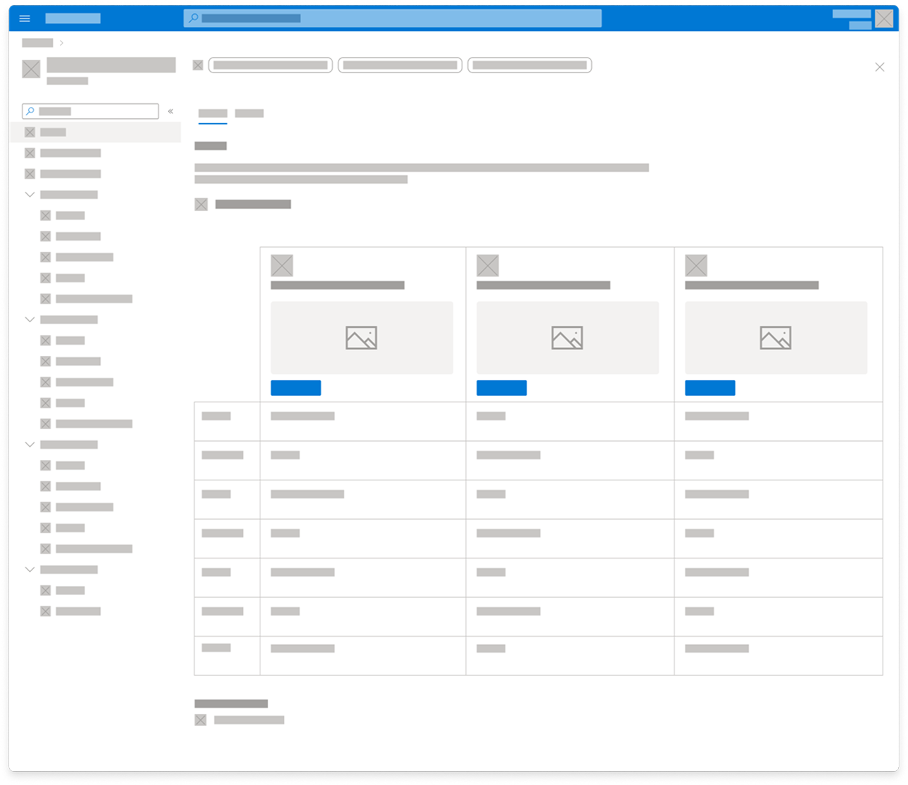
The overview page provides a landing experience that introduces the scenario and guides users toward the best starting point. It should:
Inspire confidence about choosing the right solutions
Fulfill knowledge gaps
Provide a smooth onboarding experience
Pattern elements include high-level scenario overview, highlighted services to focus early decisions, and additional detail and interactive components to guide users to the right solution.
Dashboard
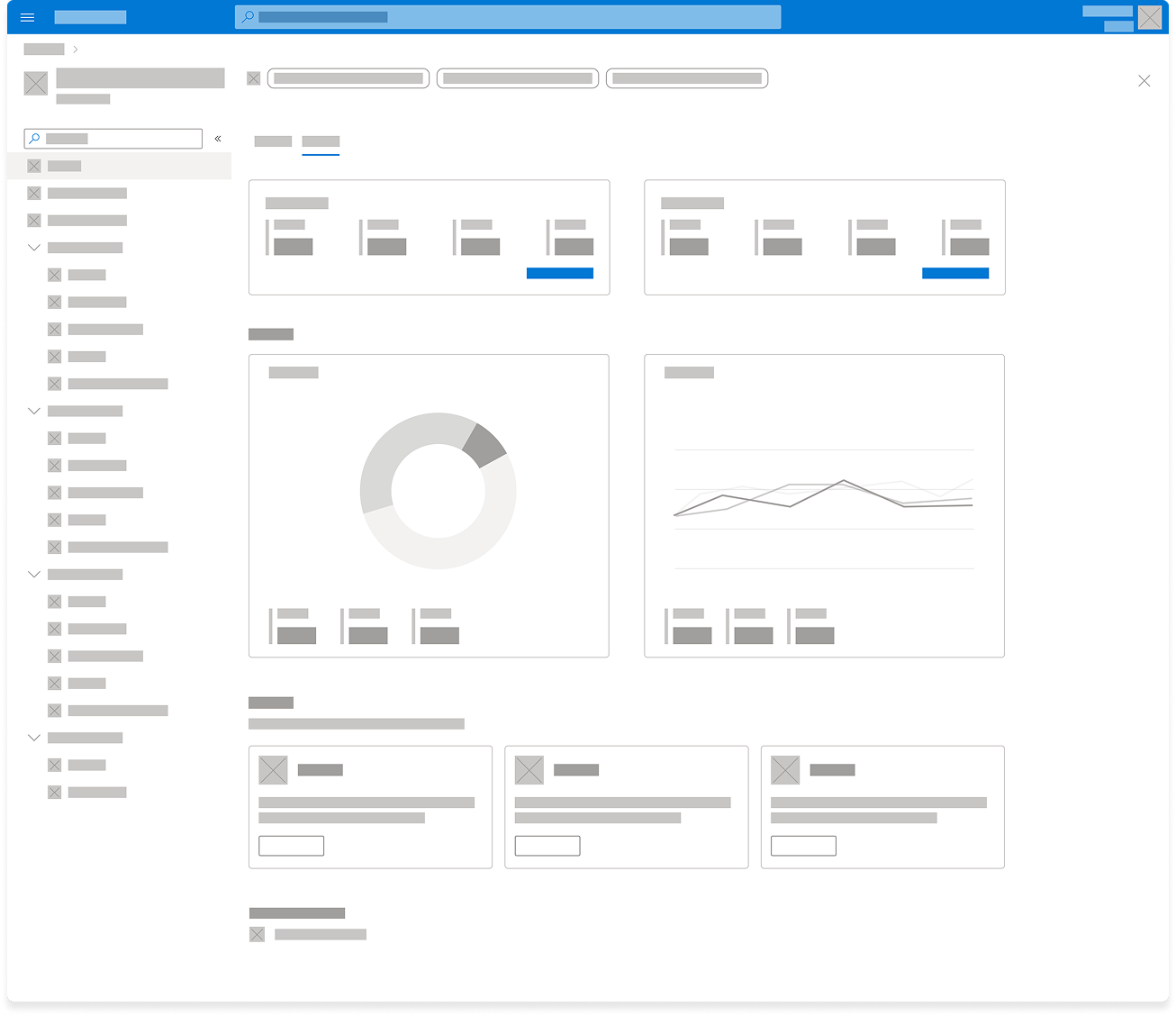
Once a workload is deployed, customers need visibility across their environment. The dashboard pattern surfaces key signals from services like Azure Advisor, resource monitoring, and policy management in one summary view, so customers can assess system health and spot optimization opportunities without stitching the picture together themselves.
Related services
In support of Azure's broader growth initiatives, the related services pattern surfaces services outside a hub's core scope — security tools, load balancing services, and data solutions — that can strengthen a customer's workload once their initial need is met, turning the hub into a jumping-off point rather than the end of a core user journey.
Creating the hub framework
To enable consistent implementation across Azure, I led the creation of formal hub design guidance. I collaborated with designers, researchers, content strategists, and PMs to document each pattern, including:
Anatomy
Interaction behavior
Content guidance
Accessibility considerations
Implementation examples
Balancing consistency and flexibility
The central tension was ensuring consistency while still allowing each product team to solve its own users' specific problem. Compute's discoverability gap and Networking's comparison problem were both real, and neither would be solved by forcing identical layouts onto fundamentally different needs.
Design approach
The resolution was a modular "mix-and-match" system — a shared library of components that any team could assemble based on which ones actually added value for their hub's core scenarios, rather than a rigid template applied uniformly.
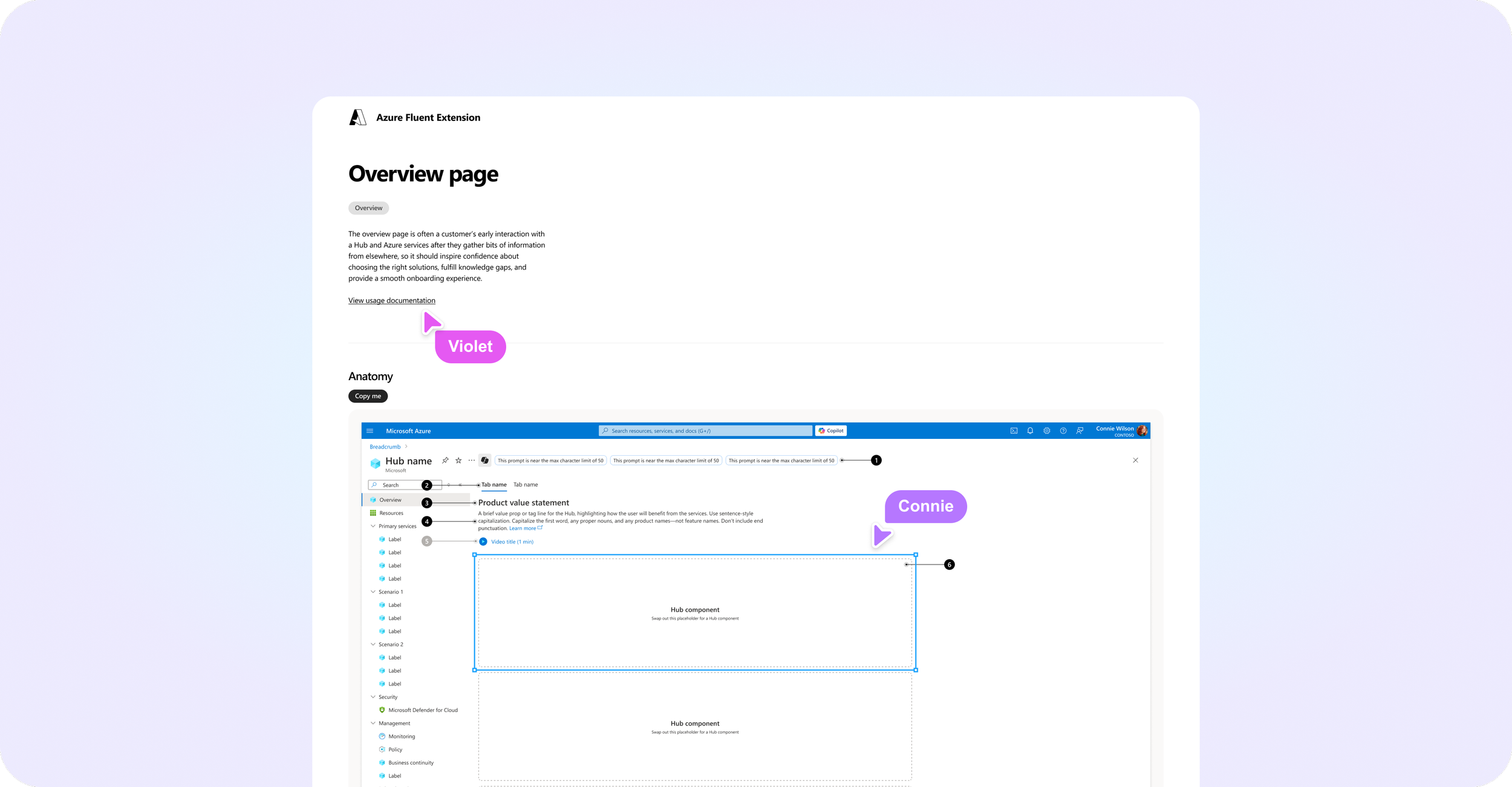
Publishing design templates
To accelerate adoption, I built ready-to-use Figma templates for each pattern, so any team onboarding to the hub model could start designing immediately by populating a template with their own content instead of building from scratch. This gave teams a fast path to coherence and made the custom way the harder option by default — which is what drives adoption of a shared system.
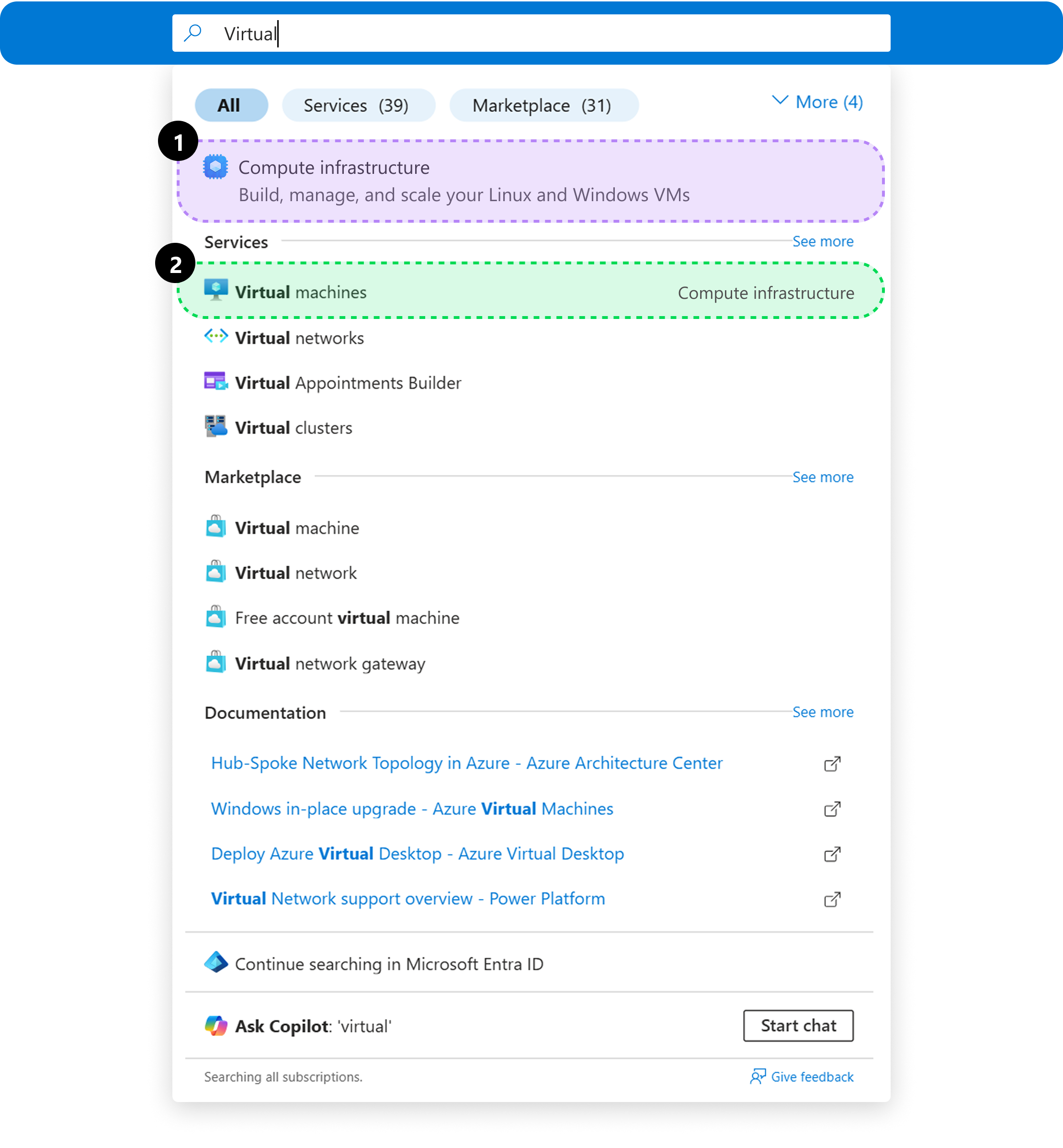
Using search across Azure
We updated navigational interactions like the search bar at the top of the Portal to reflect the consolidated scenarios in addition to specific services, allowing users to find what they need—even if they don’t know the exact service name.
Users can explore the broader scenarios¹ when unsure or jump straight to specific services² when they already know their path.
Seamless navigation across hubs
Throughout the user’s product development lifecycle, from deploying a proof of concept compute resource, to creating a connected workload with storage instructure and load-balanced traffic, to hardening that environement with security and geo-replication, the hub framework meant every step used the same underlying structure.
Scenario hubs, service pages, and search results all follow a unified framework, ensuring clarity at every step, while also tailoring guidance, interactive components, and AI-powered assistance to provide the right level of detail to help users move forward with confidence.
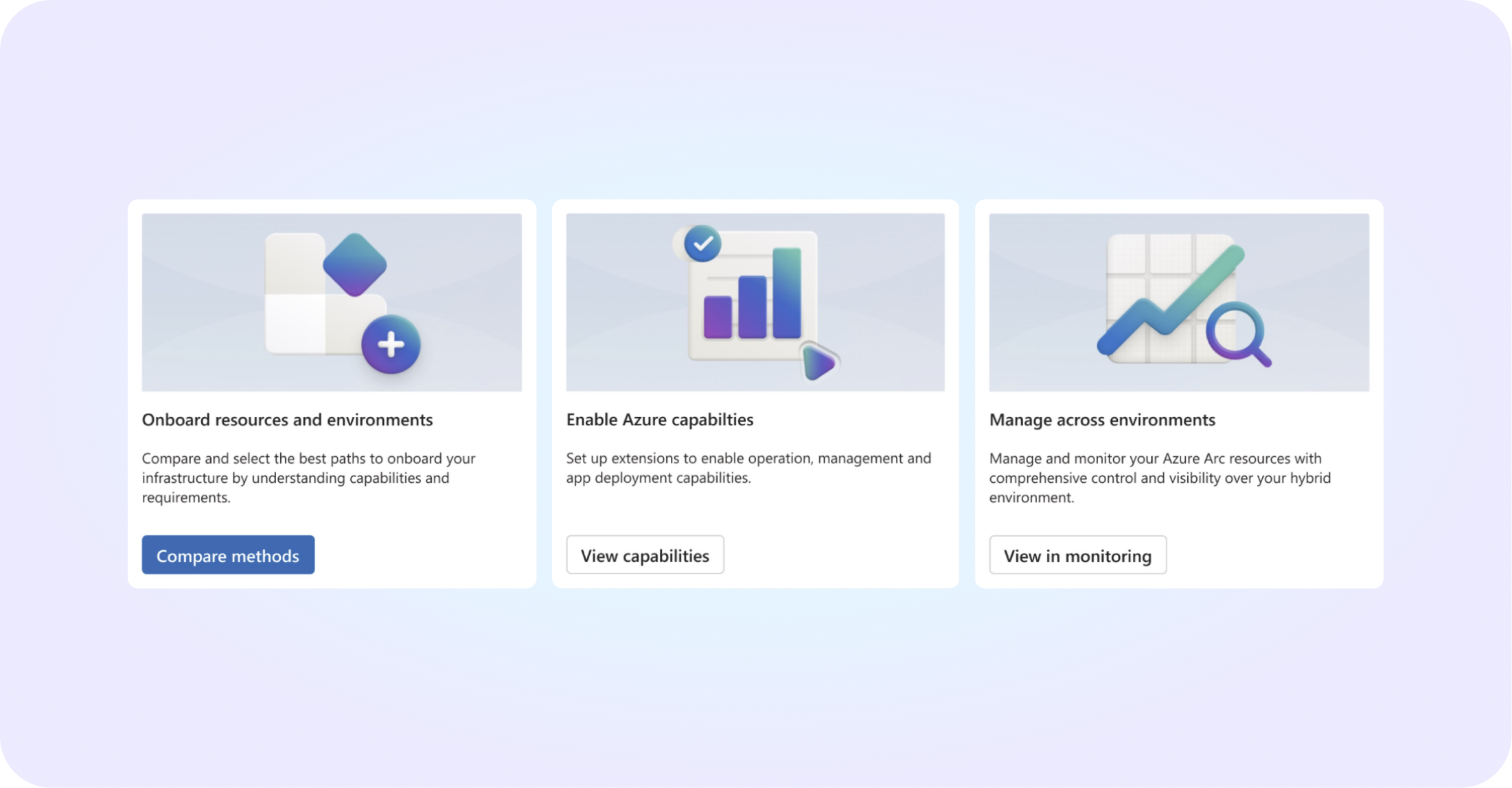
Declarative components
Before I left Microsoft, I was partnering with PM and engineering to build three of the most common hub overview-page components into a centralized code base — moving from "ask every team to align on their own" to "give every team the same component so misalignment isn't possible." This also let us modernize the look and feel by adopting the newly released Fluent 2 components for Azure.
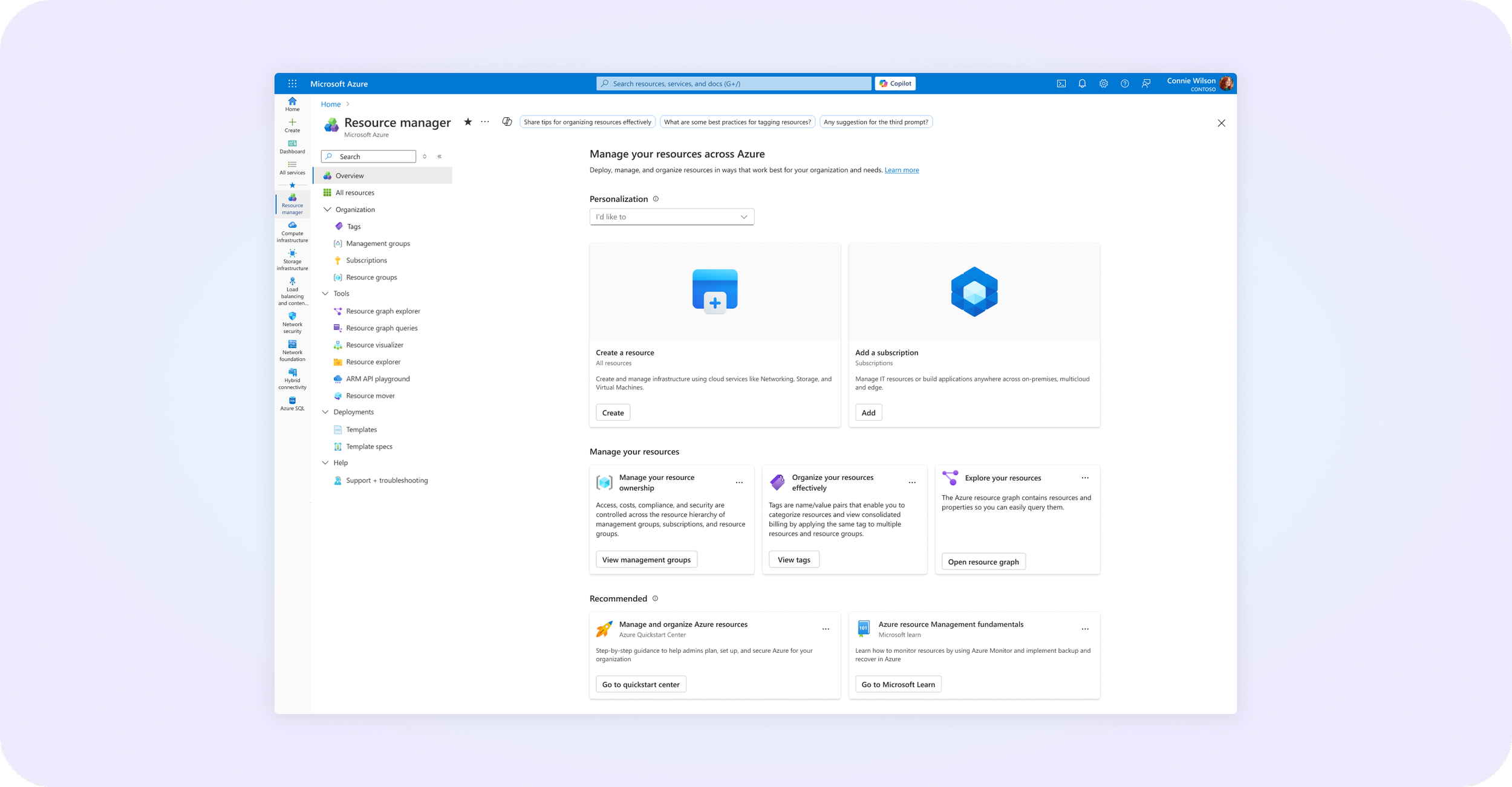
Personalization
The other major investment underway when I left was personalization: Adapting the hub experience to a customer's actual maturity with Azure, instead of showing a first-time user and a advanced enterprise user the same static page. If I continued this work, I'd finalize the maturity tiers below, driven by signals like number of tenants, subscriptions, resource groups, and service groups.
Impact
The first hub experiences launched in May 2025. The framework enabled Azure product teams to:
Deliver consistent discovery and navigation patterns across previously disconnected services
Reduce duplicated UX work by building from shared templates instead of custom designs
Align engineering investment around shared UI components rather than five parallel builds
Each team tracked improvements across discoverability, adoption, retention, and overall customer satisfaction.