Microsoft Azure Service Hubs
Client
Microsoft
Year
2025
Design for enterprise
Design systems
UX strategy
My role
I served as the lead designer for the Azure “Hub” service patterns from Jan 2024 to May 2025. I drove alignment across emerging Hubs and produced UX guidance for new teams to adopt the Hub model.
Scope + context
An effort across Azure’s core services to consolidate its offerings to simplify navigation, drive service discovery, and make it easier for customers to find and adopt the right cloud solutions.
Through regular customer satisfaction studies and surveys, we knew that our users struggled with the complexity of Azure. They were clear that they wanted it to just be simpler. They also struggled to find the right services to fit their needs. They had difficulty when trying move across the portal from one service to another.
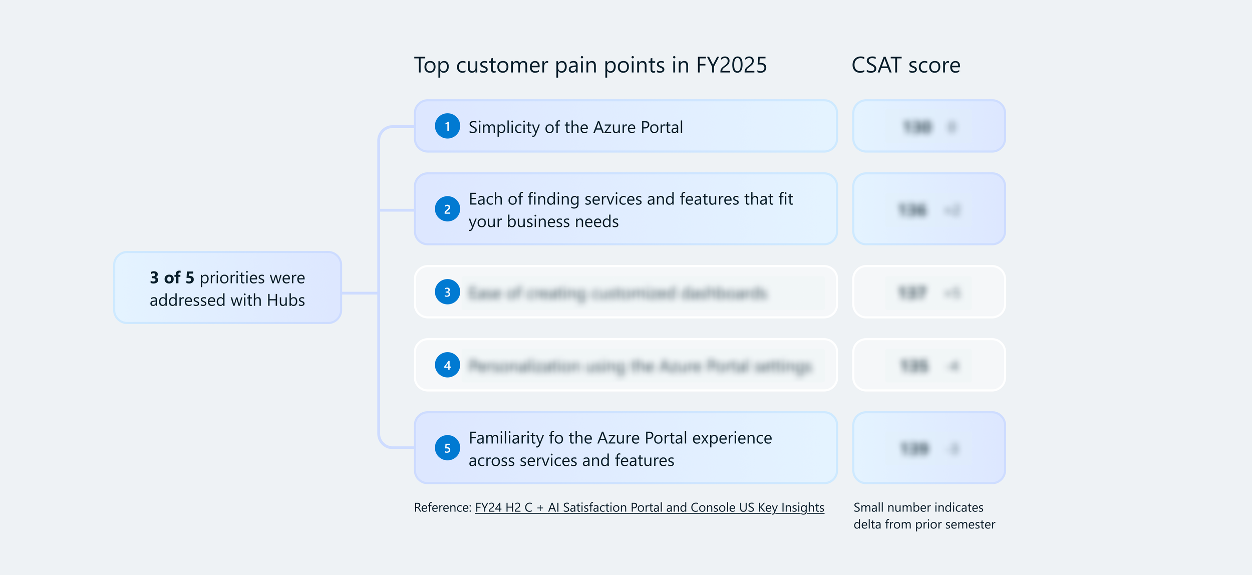
Before service consolidation, Azure’s services lacked hierarchy
Problem statement
Azure customers experienced two main issues when using the Portal:
Discovery
Customers struggled to find, understand, differentiate, and choose among our 500+ services (and growing). Services didn't necessarily align with products marketed through Azure.com and by our sales teams.
Navigation
Azure is complex and overwhelming when trying to piece together disparate services across Portal experiences to configure them to work together.
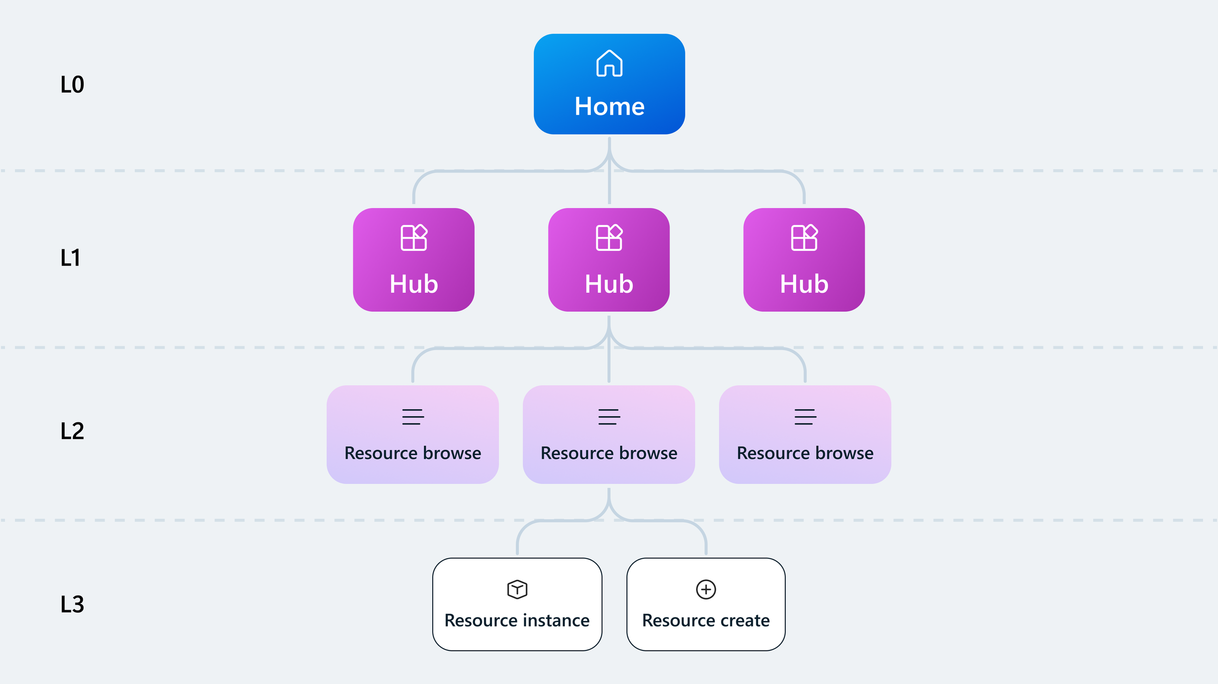
With the introduction of Hubs, relationships across products were created
What is a Hub, and how can it help?
A “Hub” is a consolidated grouping of services and resources that fulfils the needs of related user scenarios. A Hub is designed to help users:
Discover and differentiate product offerings to make a faster, educated choice
Provide critical context to support adoption and success
Support management tasks beyond resource boundaries
The process
Identifying design opportunities
To kick off the initiative, I met with each of the 3 core Azure IaaS teams—Compute, Networking, Storage—to understand their users’ needs as they navigate, discover, and compare offerings during each phase of the customer lifecycle journey.
I conducted a UX audit to evaluate coherence across the Hubs that were in progress.
The audit exercise allowed me to identify opportunities where the Hubs could align. I identified the strongest emerging design solutions that could be implemented as formal design patterns for future Hubs.
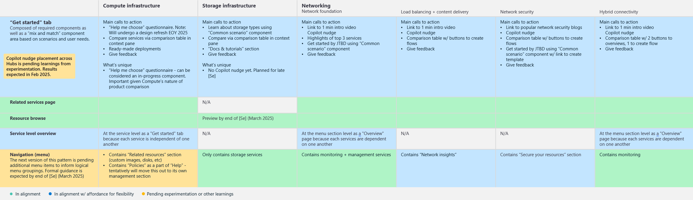
Overall, I identified 5 common design patterns and 10 core UI components that each team could adopt in their individual Hubs.
Creating design patterns
As the designer
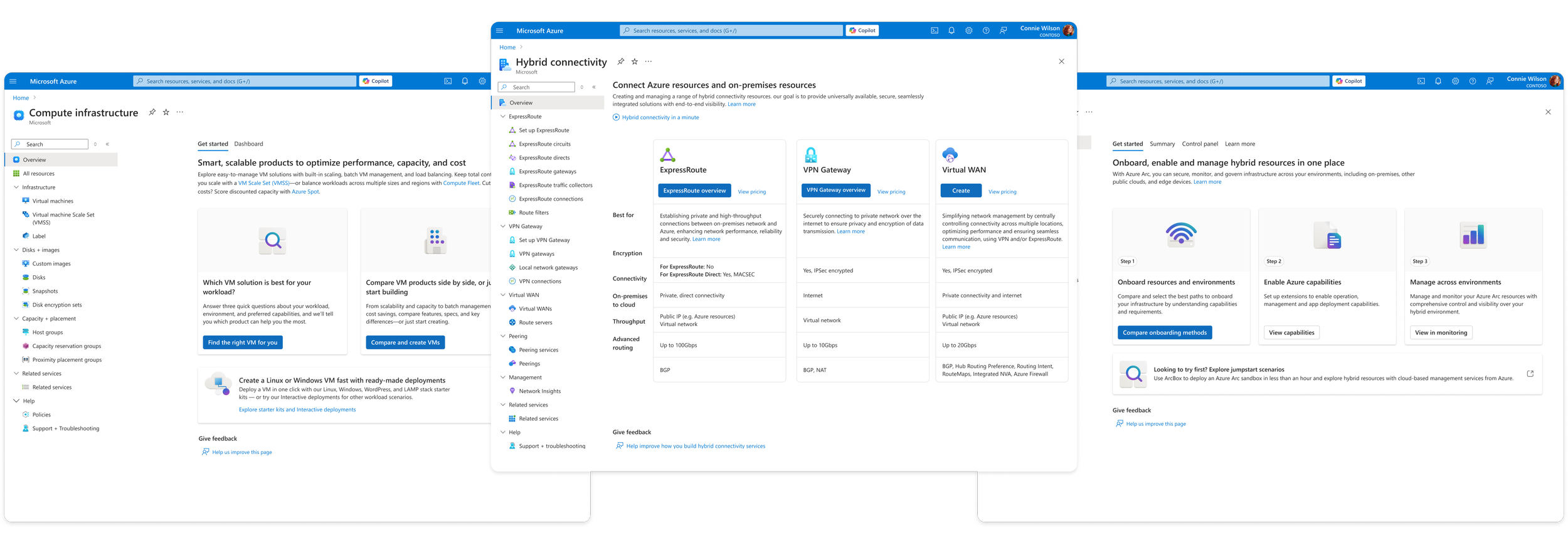
Hub overview page
The overview page is one of the user's first interaction with a Hub inside of Azure, so it should:
Inspire confidence about choosing the right solutions.
Fulfill knowledge gaps.
Provide a smooth onboarding experience
We took a “mix and match” approach to the middle (blue) content area where the product owners for each Hub could choose from our Hub component library based on their core scenarios and user needs.
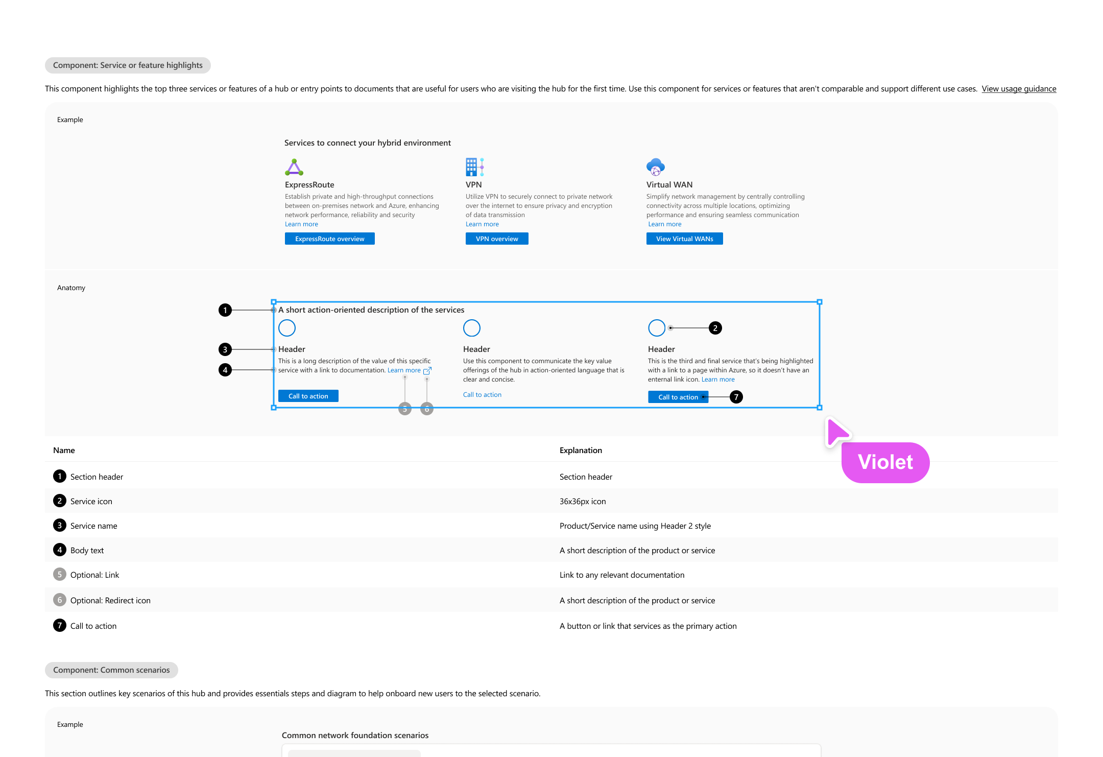
Anatomy
Copilot nudge
Menu item label
“Get started” tab label
Product value statement
Link to learning material
Space for mix and matching
Entry point to give feedback
Writing UX guidance
I led the design documentation process to ensure that any team onboarding to the Hub model would understand the core components that make up a design pattern. I collaborated with a team of Content Strategists, Designers, Researchers, and PMs to define anatomy, variations, content tips, accessibility, and when and how to use a pattern or component.
The most important aspect of writing guidance for Hubs was to clearly define where teams had flexibility and where we all needed to be consistent. Each product team had different user needs they needed to address. For example, the Compute team needed to increase the discoverability of its virtual machine scale set service, while the Networking team needed to help users understand the technical aspects of three similar offerings. So we created a “mix and match” approach to components within several of the design patterns.
These were common elements that were evaluated across the product teams, to be plugged in as needed, to give focus to those that add the most value based on a Hub’s core scenarios.
Publishing design templates
Any team that was onboarding to the Hub model could start designing quickly by leveraging our design templates. Each pattern was created in Figma, ready for a designer to populate with their content. These templates lay the foundation for consistency so that product teams can avoid creating custom designs.
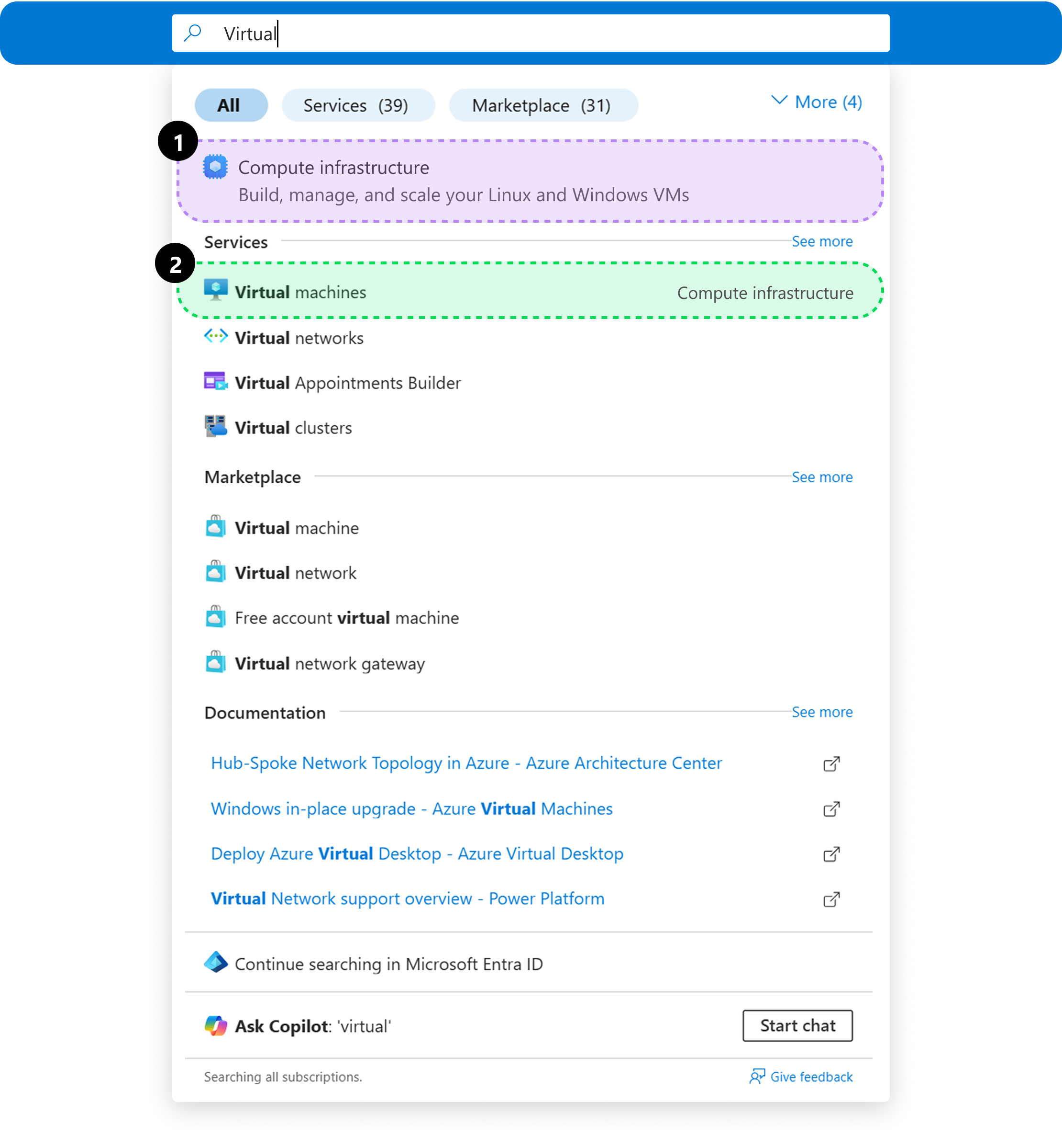
Using search across Azure
We updated navigational interactions like the search bar at the top of the Portal to reflect the consolidated scenarios in addition to specific services, allowing users to find what they need—even if they don’t know the exact service name.
Users can explore the broader scenarios¹ when unsure or jump straight to specific services² when they already know their path.
"Adri is so patient and thoughtful. She helped me highlight my work in a way that makes me so proud of my unique approach to design."
— Collette Noll